Understanding Metric Graphs
When viewing a recent time range, the metric is displayed at the frequency at which it was recorded for analysis. At longer time ranges, data is downsampled for performance reasons.
Metrics that increase monotonically (they only go up) are displayed in graphs in two ways. Their derivative value appears alongside their non-derivative value.
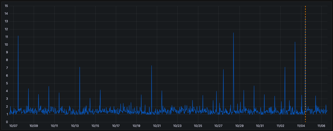
Under normal circumstances, data points are expected to fall within a typical range. Data points that fall outside this range are considered anomalies.
Anomalies
Anomalies, represented as orange vertical lines, are unexpected data points. They are not similar to recent data and don't match a pattern of expected behaviour either.
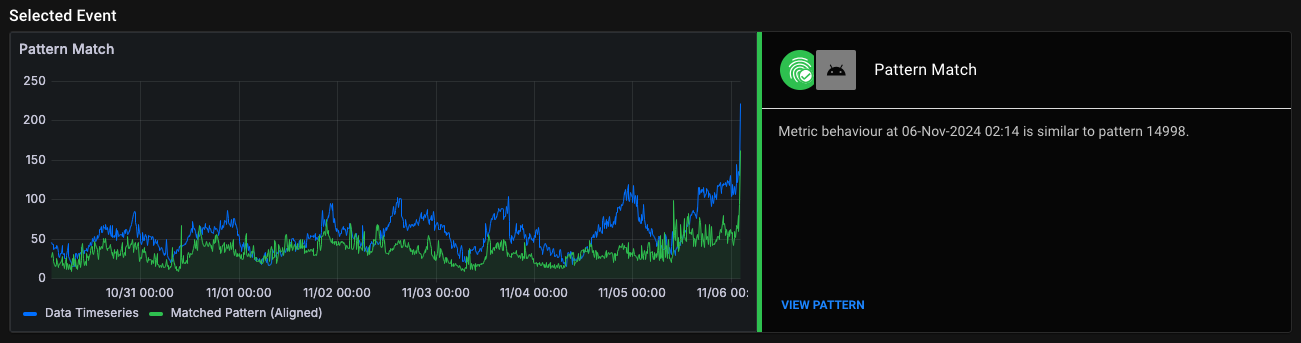
Matches
Matches, represented by green vertical lines, are data points that matched with an expected pattern of behaviour and and such have been classified as normal by Anomify.
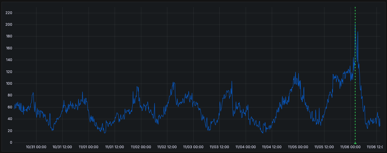
You can see the specific matching pattern under Selected Event.
False positives are data-points which started as anomalies but were relabelled as false positives as part of the training process. They are also labelled with green triangles on the graph and can be selected.